
Table of Contents
The Anatomy of a High-Converting Landing Page in 2026
A landing page is the most leveraged surface in your entire marketing stack. A 2 percent lift in conversion rate, holding everything else constant, can mean the difference between a paid campaign that loses money and one that scales profitably. And yet most service businesses send their paid traffic to a homepage that was not designed to convert.
This guide walks through the exact anatomy of a landing page that converts above-average traffic in 2026, drawing on benchmark research, our own client data, and the page patterns that consistently outperform across industries.
Why Landing Pages Beat Homepages (Every Single Time)
Homepages are designed for navigation. They serve five audiences at once: new visitors, returning customers, job seekers, press, and partners. Every link competes with the conversion. A landing page does the opposite. It serves one audience, makes one promise, and offers one next step.
Research from Unbounce consistently shows landing pages without a top navigation menu convert 10 to 15 percent better than pages with one. That single change (removing the nav) is the highest-impact, lowest-effort improvement on most paid traffic pages.
Benchmark: What Counts as a ‘High Converting’ Landing Page
Median landing page conversion rate across industries sits around 6.6 percent. The top 10 percent of pages convert above 11.5 percent. Mobile pages generally convert about 30 percent worse than desktop on equivalent traffic, which means mobile optimization is no longer optional. A page that converts 6 percent on desktop and 4 percent on mobile is leaving 30 percent of mobile traffic on the table by default.
Page speed sits underneath all of this. Studies have shown a one-second delay in load time reduces conversion rate by up to 20 percent. Pages that load in under 2.5 seconds consistently outperform slower ones, and they also receive significantly more citations in AI search engines, which is becoming an increasingly important secondary traffic source.
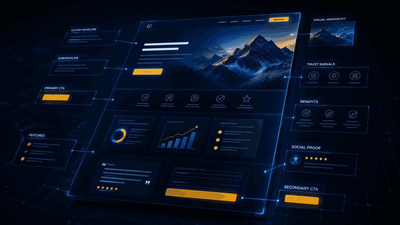
The 9 Elements of a High-Converting Landing Page
1. The Headline (One Sentence That Earns the Scroll)
The headline is responsible for roughly 80 percent of the page’s perceived value. It should name the outcome the visitor wants, in their language, and ideally match the ad they clicked. ‘Get 30 Qualified Leads in 60 Days’ beats ‘Welcome to Our Marketing Services’ every time. Test framework: outcome plus timeframe plus specificity. Use real numbers when possible. Avoid jargon and brand-speak.
2. The Subheadline (The ‘How’ That Makes It Believable)
The subhead line backs up the headline with the mechanism or differentiator. ‘Through AI-driven keyword targeting and conversion-first landing pages, no long contracts.’ This is where you handle the silent objection: ‘Sure, but how?’
3. The Hero Visual
A hero image, product screenshot, or short looping video that visually demonstrates the outcome. Avoid generic stock photos. The fastest-converting heroes show either the product in action or the human result (the happy customer, the dashboard with real numbers, the finished home).
4. The Primary Call to Action (Above the Fold, Single Choice)
One button. One offer. One color that contrasts with the rest of the page. The button label should describe the outcome, not the action. ‘Get My Free Audit’ converts better than ‘Submit.’ Place it where the user does not have to scroll on either desktop or mobile.
5. Social Proof at the Top
Logos of well-known clients, a video testimonial, a third-party review score, or a ‘trusted by X businesses’ line. Place at least one piece of social proof above the fold. This single element can lift conversion rate by 20 percent or more when added to pages that previously had none.
6. Benefit-Driven Body Copy
Once they scroll, three to five benefit-led sections that answer ‘What is in it for me?’ Lead each section with the outcome, support with a feature, and back up with a number or proof point. Skip the company history. The visitor does not care yet.
7. Detailed Social Proof Section
Deeper testimonials with full names, photos, company logos, and specific results. Case study snippets. Star ratings from independent platforms. The more specific the proof, the more believable it becomes.
8. Objection-Handling FAQ
Six to ten questions that handle the actual objections your sales team hears every week. ‘How much does it cost?’ ‘How long until I see results?’ ‘What if it does not work?’ This section also doubles as fuel for AI search citations, because AI engines love clean FAQ content.
9. The Final Call to Action
Repeat the offer at the bottom, framed slightly differently. By the time a visitor scrolls to the bottom, they are either ready to convert or they need one more reason. Add urgency (limited spots, time-limited bonus) and risk reversal (money-back guarantee, no long contracts) to close the loop.
Above-the-Fold: The First Three Seconds
Above-the-fold is the portion of the page visible without scrolling. On desktop and especially on mobile, the visitor decides within three seconds whether to stay or leave. That window must answer three questions:
• What is this? (The headline)
• Why should I care? (The subheadline and hero visual)
• What do you want me to do? (The primary call to action)
If any of those three are missing or buried, the bounce rate climbs and the conversion rate falls. Everything below the fold is a secondary layer of persuasion for visitors who are already interested.
The Conversion Killers to Remove
• Top navigation menus that send visitors off the page.
• Multiple competing offers in the hero section.
• Auto-playing video with sound, which causes immediate exits on mobile.
• Massive hero images that push the call to action below the fold.
• Generic stock photos that signal ‘template page.’
• Long forms above the fold. Ask only for what you need to start the conversation.
• Slow page load. Anything over three seconds bleeds conversions.
• Carousel sliders, which research consistently shows reduce conversion rate.
Mobile First, Not Mobile Last
More than 60 percent of paid traffic now comes from mobile in most industries. If your page is designed on desktop and ‘optimized’ for mobile as an afterthought, you are losing the majority of your traffic. Design the mobile experience first, then expand to desktop. Keep hero sections tight, use sticky calls to action, and test load speed on real 4G connections.
Testing: Your Page Is Never Done
The highest-converting pages are the ones that get tested every 30 days. The pattern that works:
1. Pick one variable. Headline, hero image, call to action, social proof location. Change one thing at a time.
2. Run the test for 14 days or 1,000 visits, whichever is longer. Anything shorter and the result is statistical noise.
3. Keep the winner. Then test the next variable. Compounded over a year, this process can double a landing page’s conversion rate.
Use Behavior Data, Not Just Conversion Rate
Conversion rate tells you what happened. It does not tell you why. The pages that compound performance fastest use three additional tools to diagnose where visitors are losing interest.
• Heatmaps. Tools like Hotjar, Microsoft Clarity, and Crazy Egg show exactly where visitors click, how far they scroll, and which elements they ignore. If 80 percent of visitors never scroll past your hero, your hero is doing the wrong job.
• Session recordings. Watching ten real visitor sessions teaches more than a quarter of A/B testing. You will see exactly where people hesitate, where they get confused, and where they bounce.
• Form analytics. Tools like Formisimo or Hotjar’s form tracking show which form field causes the most abandonment. Often a single field (phone number, business size, budget) is killing the entire conversion path.
These tools are cheap, often free at low volume, and produce an unfair advantage compared to teams that only look at top-line conversion rate. Add them to every paid landing page from day one.
Industry-Specific Conversion Benchmarks
Average landing page conversion rate varies meaningfully by industry. Use these as rough targets for what ‘good’ looks like in your category:
• Legal services: 5 to 7 percent
• Home services such as plumbing, HVAC, and contractors: 8 to 12 percent
• Healthcare and medical: 3 to 5 percent
• Ecommerce product pages: 2 to 4 percent
• SaaS and B2B lead generation: 4 to 6 percent
• Real estate: 2 to 4 percent
• Education and online courses: 6 to 10 percent
If you are inside or above your industry range, focus on increasing traffic quality. If you are below, fix the page before you spend another dollar on ads.
Frequently Asked Questions
- Q: Should every campaign have its own landing page?
- Yes. Different campaigns target different intents and offers. One landing page per campaign almost always outperforms a single ‘master’ page trying to serve everyone.
- Q: How long should a landing page be?
- As long as it needs to be. For low-friction offers (free audit, free download), short pages convert best. For high-ticket services, long-form pages with deep proof outperform short pages. The rule is: as long as it needs to be, no longer.
- Q: Do I need a designer or can I use a builder?
- Modern builders like Unbounce, Webflow, Instapage, and Framer can produce pages that convert as well as custom-coded ones. The structure and copy matter far more than the underlying tech. Most clients we work with use a builder for speed and bring in a designer only for high-stakes pages.
Let’s Get Started and Connect
Fill out our quick form below and one of our marketing analysis will call you and discuss what Send It Rising can do for your site. Don’t forget to ask about the free site audit!