")
Table of Contents
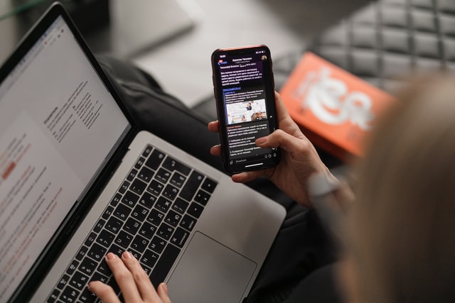
In decades past, people accessed the Internet exclusively through their desktop computers. Today, people access the Internet through their phones, tablets, smartphones, and other devices. Every device has a different screen size. No matter how they access your website, visitors expect it to load quickly and show them the information they need. If your website doesn’t look attractive on specific resolutions, your viewers might check out a competitor’s website instead.
To succeed in the online market, you’ll need to stop focusing on fixed layouts and invest in responsive design. Responsive design adapts to several resolutions and screen types. Whether your visitors use their tablet, smartphone, or laptop, they’ll see a crisp, dynamic website that only takes seconds to load. This encourages visitors to stay and browse your website–and the longer they remain on your site, the better your chances of making the sale.
Why is Responsive Design so Important?
Mainly, responsive design ensures that your website looks great on virtually any device. However, many business owners don’t realize that Google prioritizes mobile websites over traditional websites when it returns the search engine results. You could spend thousands of dollars on web design, but if your mobile website is clumsy and difficult to use, you won’t rank highly in the Google results.
For this reason, it’s more important than ever to optimize your website for mobile and tablet use. Studies have shown that over half of all website traffic comes from smartphones. When you have a clean, optimized website that looks great on smartphones as well as laptops, you’ll climb the Google search rankings and solidify your customer base.
Responsive design also ensures that your customers walk away with a positive view of your company. If you browsed a mobile website with tiny links, misplaced columns, and crowded images, would you see that business as a professional, efficient company? Your website is part of your image, and responsive design ensures that you make a positive impression.
Why Can’t You Use Your Regular Website?
Elements that look great on a laptop don’t always translate to mobile devices. For example, drop-down boxes work well on traditional websites. All your viewers have to do is click the box, select their option and watch the page load in less than a second. On mobile, drop-down boxes are much more complicated. Your viewers have to tap the screen repeatedly to get what they want–and if your website isn’t optimized, drop-down boxes are even harder to use.
Additionally, regular websites don’t display well on mobile devices. Your visitors might see your entire website when they visit your page. However, mobile devices tend to shrink the webpage, so they’ll have to zoom in and manually scroll around to see everything. Links are smaller and harder to click, and text can be nearly unreadable. Some elements might even be broken because they can’t transfer to mobile.
When visitors can’t find what they need within a few minutes–or a few seconds if they’re in a hurry–they’ll give up and check out another business. You’ll lose a sale that you might have gained if you optimized your site.
What is Responsive Design vs. Adaptive Design?
Once you’ve hired a website design company, you might hear two terms: responsive design and adaptive design. Responsive design takes one page and displays it differently according to the device that the visitor uses. Conversely, adaptive design produces multiple pages and uses a different page for each device. Some website builders prefer responsive design because it only requires one template.
How Do You Optimize Your Website?
Ultimately, you’ll need to talk to an SEO company like Send It Rising to optimize your website for multiple screens. Web optimization is a complex process that involves restructuring your layout and doing in-depth research. Here are a few methods that Send It Rising could use to optimize your site:
- Switch to a fluid layout. Traditionally, web designers gave each element a set pixel size, like 500px. A fluid layout uses percentages instead of pixels so the website can adjust according to the device’s size.
- Increasing your page’s loading speed. Some websites load quickly on your desktop but take several seconds to load on your smartphone. These websites have bulky elements that don’t translate well to mobile. Send It Rising could compress and remove these elements as much as possible so your homepage loads quickly whenever you access it.
- Increase the size of elements. If you have small elements on your page, they might be difficult to see on your laptop, but they’re nearly impossible to see on a smartphone. Tablets and devices shrink everything on the page. A web design company might adjust or resize elements so they’re visible across different platforms.
- Make your homepage simpler. Most people are willing to put more work into using their tablet or desktop computer, primarily if they work from home. However, few people work exclusively from their smartphones. They get their content instantly in short bursts–and an excellent mobile website recreates that experience. You might need to trim excess text and elements or make parts of your site easier to use, so it doesn’t interrupt the flow of the mobile experience.
- Use a responsive checker tool. With these online tools, you can enter your URL and see how your site looks across different platforms. This makes it easier to figure out what needs adjusting.
- Figure out the most common screen sizes. You can’t plan for every single screen size, but you can make a plan for the most common resolutions. Note that the most common screen sizes change over time.
- Limit the amount of typing involved. While typing is easy on a laptop, it’s much more challenging when using the virtual keyboard on a phone or tablet. Your web designer might suggest limiting the use of forms or altering their inputs.
With a fully optimized website, you’ll get visitors from all over the web who discovered your site through their phones, laptops, and tablets.
What Are the Most Common Screen Sizes for Website Design?
For 2020-2021, studies have shown that 1920×1080 is the most common screen size among web users. 1366×768 comes in second. Some studies place 360×640 in third, while others place it further down the list. A digital marketing company like Send It Rising will research the most common screen resolutions.
While these sizes might be standard now, they could start to drop down the ranks in the future. New advancements in technology come with different screen resolutions for smartphones, tablets, and laptops. Some devices enjoy a wave of popularity that temporarily boosts their resolution’s importance. This is one reason you should periodically review your web design strategy–a design that looks fresh and modern today could be old and outdated a year from now.

Who Is Send it Rising Internet Marketing?
Complete web optimization could make or break your business strategy. When you hire our internet marketing company, we’ll optimize your website so every customer gets the same great experience. Mobile, tablet, and desktop users can browse your website, check out your products or services and place an order with ease. You’ll also notice increased traffic as your website climbs the Google search rankings and outpaces your competitors.
If you’re a new startup, reach out to Send It Rising and launch a great website right out of the gate. You’ll put yourself ahead of competitors that wasted time with a clumsy, unresponsive website before they talked to web design professionals. We can also upgrade and optimize existing websites to rocket your website ahead of the competition. Even if you’ve modernized your site, talk to us about final adjustments that could give your business the boost that it needs.
Our services start with advanced SEO that makes it easier for customers in your region to find your webpage. When you need blog posts, videos, and other pieces of content, we craft dynamic web content that draws more visitors to your business. Other services include graphic design, social media consulting, and Google Ads campaign management. Send It Rising can also help you build an e-commerce website and boost your site’s security. Start with a free web audit today, then reach out to us to learn more about what we can do for you.
Let’s Get Started and Connect
Fill out our quick form below and one of our marketing analysis will call you and discuss what Send It Rising can do for your site. Don’t forget to ask about the free site audit!